How to critique
Each month members of the IlloGuild answer a question together and this month it is: “How do you review an illustration?”
To answer this question we should first think about what makes a powerful illustration. AndyJPizza explains that:
what you leave out is as important as what you leave in. Illustration is the power to communicate complex objects with imagination. The trick is to pick one thing to communicate - take one idea and present it with a twist.
This past year was the first time I experienced reviewing the work of others and initially it was baby steps - explaining my FEELINGS that the work tapped into, such as pleasure. It was about colour theory and execution of drawing. Then I realised how much effort went into composition, line of gesture, light values in greyscale, weights of characters and connections between them. Every time I heard of a new technical aspect, I sought out a Skillshare class to find out more. (Get one month free here)
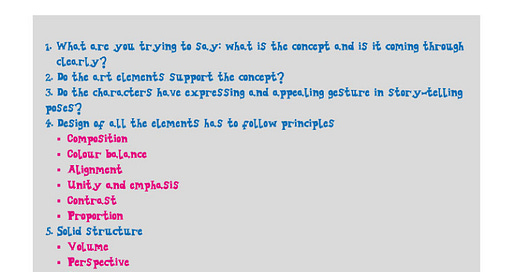
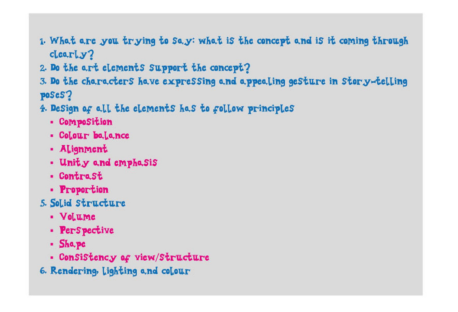
Recently I have been listening to a number of podcasts which cover this topic. I recommend this Episode with 3 Point Perspective. In summary, these 3 professionals list out some points to look for:
As a self-taught artist, many of these concepts are new to me. Over the past 12 months I have paid for 2 professional critiques on my portfolio and in both instances I provided 10-15 pieces of work with a link to my website.
Here is what I learned:
Review 1
Two ladies from a boutique agency provided me with feedback by zoom, organised by SCBWI. This was my first portfolio review and I was very nervous. I had provided a wide range of pieces and pitched myself as an aspiring illustrator, seeking feedback on which of my styles resonated or felt commercial enough to be developed further.
Here are thumbnail images of my folder:
What they said:
It is a skill to be able to present many colour palettes in diff styles/versatile
Consider using a pseudonym under Tabbykat studio for each style
Greetings cards could be ready to go immediately, especially the birds
Take care of proportions and size eg cat is bigger than wall in second image
Texture and foreground vs detailed background aspects are interesting
Home decor work could be included but use a sensible linktree to divert attention to alternative IG accounts
Composition of Lex is good but the typography is not working and resolution is weak
Jungle scene is missing a focal point
What they advised:
Draw a motif in many different ways across lots of pages before committing to an illustration, then apply one style
Editorial style is the most exciting and professional - make several sheets of characters in this style including vignettes
Make 10 different houses in this strong style - nicely drawn
Try different vew points eg from above for Cleo scene
Man in orange jumper is funny - try a full character sheet of this guy
Make 5 -10 pieces in 2 or 3 styles
Invest in a good quality scanner or draw larger images
Look at Rose Wilkinson for a similar feel of colour palette; continue with good diversity of people by changing body sizes, ages, diversity, disability from a modern day perspective
Make additional birds in different sizes
Create a library of motifs
Get characters interacting with one another and practice hands and feet proportions
Create full bleed scenes with details, books covers and vignettes, think about national celebration days, IG hashtags, seasons and current affairs
Look at publishers websites and bookstores
Ensure all social media is up to date
Consider issues which are important to you
Review 2
At the November SCBWI conference (6 months later) I secured a place with a top Agent, face to face. I provided a portfolio of 12 pieces, 6 in a new watercolour style and 6 older pieces which brought me the most joy to create.
Here are thumbnail images of my folder:
What they said:
You can clearly do [childrens’ book illustration] but your portfolio is not showing me what I need to see
The watercolour faces are terrifying for picture books. Some of your work could be more suitable for middle grade, then you can get away with more defined faces, shading and strong emotions.
You have actually drawn lots of people [in laptop folders] but they are all static and front facing so get them interacting and looking at one another.
Your work is quite traditional, maybe old fashioned. Indoor and outdoor scenes are good but do not contain any people or animals.
The watercolours are nice but starting to get murky with the shadow underlayer. I want to see the plumage on the birds and it is getting lost.
The outdoors highland pictures are lovely. The interior for Nico/Granda is great. The watercolour editorial are really interesting and lots of the individual spots could be broken out and expanded. They could be on greeting cards right now.
What they advised:
The next level for you is connection between animals or people, with a full body and face. If scenes are too much, just vignettes. You are not allowed to draw shapes with connections yet - they are more difficult. eg Pip and Egg.
Show parents with kids; get all of the kid proportions correct; practice 4-5 year olds; show diversity. Look at the book 'Show how much you love me'. Dig out personal photos.
Don't stop developing your skills in picture books to concentrate on patterns or non fiction. Wait until you have improved your skills in picture books and then present yourself as the entire package - toys, stationary, book and patterns.
You are just at the start of your journey and keep going. Keep experimenting. You are like a kid in a candy shop and soon you will need to pick one [media] to work most in. Which media lights you up? All of the practice is the right thing to do until you find something that sticks.
Don't start with the colour palette. Always start with the story.
Conclusion
Both reviews spurred me to create a large body of work in a short amount of time. I personally prefer to work this way and then take a break to recoup. I also struggle to commit to one type of media because I get bored! At one point when I do pick and stick, I will secretly continue playing with all manner of media in my sketchbook to keep the flame alive. That said, I am going to now concentrate on my editorial style of pen and watercolour for characters and the flatter shapes of gouache and pencil for more landscapes. One of them will win out for drafting a non-fiction book.
In time I must start submitting work to both agents and publishers to move my illustration out of the learning zone and into the earning zone. Certainly 2022 has provided me with ample opportunity to learn about critiquing work from peers, mentors and professionals. I recommend improving your own critique skills in order to look at any existing portfolio with dispassionate eyes and take your work up to the next level. So let’s get to work!


Thanks for sharing your reviews. I have discovered impulses for myself - so this is super helpful!